Sunday, January 31, 2016

10 New Trends of Logo Design for 2016

http://www.designbolts.com/2015/12/12/10-new-trends-of-logo-design-for-2016/

10 New Trends of Logo Design for 2016


This has been a great year for logo exploration as most of the designers were following logo design trends of 2015. I have been analyzing whole year that what new can be done and where we are heading towards. Let us know what kind of logos are made in 2015 and what logo designs have been approved the whole year.
Here are the few hints and a guide to know what should be done regarding logo designs in the year 2016.
George Bokhua introduced a new technique of logo designing and named it “negative space logos” which was the most famous trend that clients kept on asking. Some even asked for the negative space logo version of their current logo. For that reason, I am starting with George style as negative space needs more time and still requires more experimentation.

1. Negative Space Logo Design

It is always a good idea to be as simple as possible while creating logo designs. The more elements and colors you add the more it will be problematic for larger scale printing and it won’t be cost effective. If you want to stay simple yet creative you should follow negative space trend.
I am giving you two options for these logos first one is simple negative space.
Credit: 1234
Simple-Negative-Space-Logo-trend-2016Simple-Negative-Space-Logo-trend-2016-2

2nd one is Negative space with dual impression
Flat-Logo-Design-Examples-2015----(3)
Duel-impression-Negative-Space-Logo-trend-2016Duel-impression-Negative-Space-Logo-trend-2016-2
More beautiful examples of negative space logo designs for inspiration

2. Overlaping Gradients logo Design

Shiny color schemes are implied while making overlapping gradients in the logo design. Normally web based companies ask for this technique to be used in their logo design for a greater impact and beauty.
More Stunning examples for Gradient logo designs also some more by Yuri
credit: 123
Overlapping-gradients-logo-design-trend-2016
Overlapping-gradients-logo-design-trend-2016-3
Overlapping-gradients-Fox-logo-design-2016
Overlapping-gradients-Dear-logo-design
Overlapping-gradients-cheetah-logo-design-2016

3. Offset Logo Designs

In this technique of logo design, the initials of the company is being utilized, the designer plays with the initials of the company after being asked to make use of their initial as their logo mark. Offset path is used to give a very nice touch to the logo which makes it noticeable.
credit: 123
Offset-logo-design-trend-2016Offset-logo-design-trend-2016-2Offset-logo-design-trend-2016-3

4. Overlapping with shadows logo design

Overlapping technique was much in use in the year 2015. It is basically a technique where two elements of design overlap each other to give a shadowed feel in the logo design.
More examples in Overlapped Logo Design
credit: 12
A-Overlapping-Technique-logo-design-trend-2016VC-logo-design-trend-2016

5. Subtle Gradients Usage in Logotype

For a smooth feel subtle gradients are used in the logotype, which adds to the richness of the logo & make it look professional in the appearance.
Logo-Design-&-Logotype-Examples-(4)
Logo-Design-&-Logotype-Examples-(16)
Logo-Design-&-Logotype-Examples-(17)

6. Bold & Thin line usage in logo design

Thin and bold lines are being used to draw the logo design and there is no usage of fill object in this technique. It is made with the help of pen tool. Bold and thin line usage makes the logo design amazing.
credit: 1234
Flat-Logo-Design-Examples-2015-(2)
Bold-line-logo-design-trend-2016-3thinline-logo-design-trend-2016thinline-logo-design-trend-2016-2
Zen-dude-hospital-logo-design-trend-2016

7. One Line Art Logo Designs

This technique is magical which will be a totally new technique for 2016, it is used to make a dynamic logo design where one plays with the line technique. There are no multiple strokes’ usage in the formation of this type of logo design.
More One line art logos for inspiration
One-line-logo-design-trend-2016One-line-ostrich-logo-design-2016

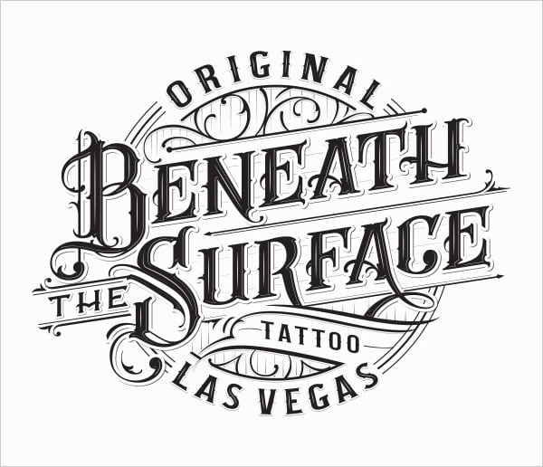
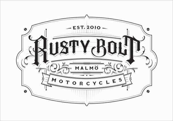
8. Hand lettering usage in logo design

Hand letterers use this technique to make logo design remarkable where feeble\pointer pens are used to give a delicate feel to the logo design. It looks stunning and sophisticated.
inspiring-hand-lettering-logotype-examples-2016 (15)
inspiring-hand-lettering-logotype-examples-2016 (4)
inspiring-hand-lettering-logotype-examples-2016 (20)

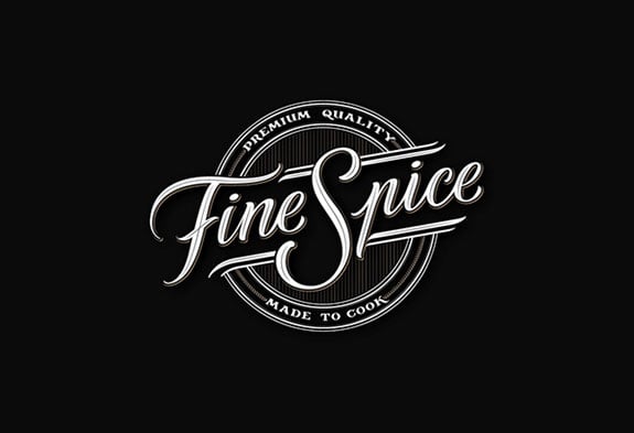
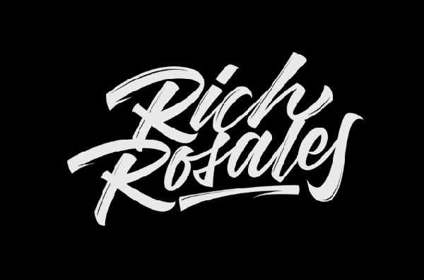
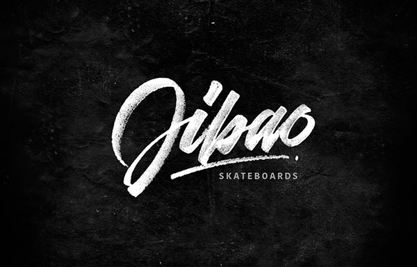
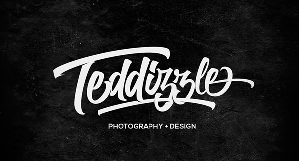
9. Brush Pen Usage in Logotype

Brush pen was firstly used to compose Japanese and Chinese letters. Brush pen is also called fudepen. Hand letterers use this brush pen to make the beautiful kind of logotypes. Now this style is implied to write brand names and these type styles has been widely used in packaging. This technique looks more like being drawn by a paint brush. Here you can buy Pro Dual End Brush Pen Set if you want to give it a try to brush pen logos. Don’t forget to check out David Milan for his exceptional brush pen work.
More beautiful examples of brush pen logotype
Hand-Lettering-Logotype-Examples-(5)
Exceptional-Hand-Lettering-Logotype-Examples-(18)
Exceptional-Hand-Lettering-Logotype-Examples-(2)

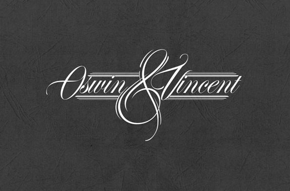
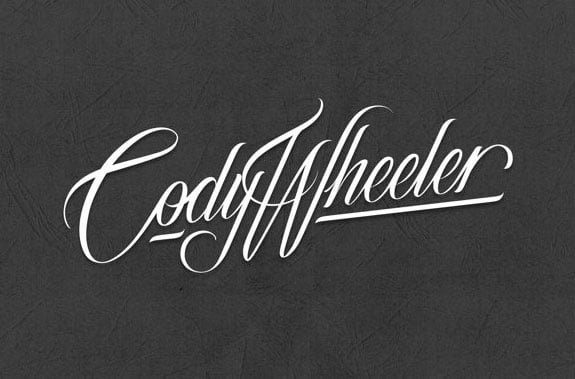
10. Copperplate Script Calligraphy usage in Logotype

There is also a technique of copperplate script calligraphy where oblique pen is used to give a retro feel to the logos, people are following it and liking this techniques to be used in their logos.
You can start script calligraphy with speedball oblique pen set
More Examples on dribbble
credit: 12
50+ Inspiring-Hand-Lettering-Logotype-Examples-by-Mateusz-Witczak (25)
50+ Inspiring-Hand-Lettering-Logotype-Examples-by-Mateusz-Witczak (47)
vive_tote_Script-calligraphy-logotype-logo-design-2016
best-logotype-examples-logotypes-2014 (27)


Monday, January 25, 2016

commercial envelopes: die-lines

Business correspondence envelopes come with a variety 
of flap styles and sizes. The most common is the number 10 with either a commercial flap or a square flap.

commercial flap
These envelopes are designed for machine insertion making them an ideal and efficient choice for direct mail, invoices, checks and statements. Commercial envelopes are also often used for letterhead and personal correspondence. They open along the top and have diagonal seams.

square flap
Square flap business envelopes are often used to add a contemporary flair to correspondence. These envelopes are well suited for engraving, thermography and other printing processes, but are not recommended for automatic insertion equipment.

policy flap
With the opening on the end of the envelope, policy envelopes are often used for custom marketing material and invitations.

dl international
Engineered to ensure maximum opacity which provides for a more confidential presentation, DL International envelopes are available in CRANE'S CREST® Papers only.

Commercial Envelopes Sizes


download die-lines
#10 download Die Line (.eps)


resources from http://www.neenahpaper.com/resources/aboutenvelopes/envelopetypes/commercial


Complete your letterhead, invitation or direct mail piece with Neenah Paper envelopes.
Envelopes are available in a variety of sizes, finishes and colors in all of your favorite brands including: CLASSIC CREST® Papers, CLASSIC® Linen Papers, CLASSIC® Laid Papers, ENVIRONMENT® Papers, ESSE® Papers, OXFORD® Papers, EAMES™ Paper Collection and even CLEARFOLD® Translucent Papers.
We also offer a large selection of CRANE® Papers envelopes perfect for your most important events.
horizontal divide
A-Style EnvelopesA-Style Envelopes
Most commonly used for announcements, invitations, cards, small booklets, brochures or promotional pieces, these envelopes typically have square flaps and come in a variety of popular sizes. Designed for use with matching text and cover papers, A-style envelopes are able to have deckle-edge flaps.
download die-lines
NumberSize (in.)Download Die Lines  (PDF)  (EPS) Show Products
A-2
4 3/8 x 5 3/4
A-2 Announcement Envelope
A-6
4 3/4 x 6 1/2
A-6 Announcement Envelope
A-7
5 1/4 x 7 1/4
A-7 Announcement Envelope
A-8
5 1/2 x 8 1/8
A-8 Announcement Envelope
A-9
A-9 Announcement Envelope
A-10
6 x 9 1/2
A-10 Announcement Envelope
Slimline
3 7/8 x 8 7/8
Slimline Announcement Envelope

horizontal divide
Baronial EnvelopesBaronial Envelopes
More formal and traditional than the A-style envelopes, baronials are deeper and have a large pointed flap. They are popular for invitations, greeting cards, announcements and more.
download die-lines
NumberSize (in.)Download Die Lines  (PDF)  (EPS) Show Products
4
3 5/8 x 5 1/8
4 Baronial Envelope
5
4 1/8 x 5 5/8
5 Baronial Envelope
5 1/2
4 3/8 x 5 3/4
5 1/2 Baronial Envelope
6
4 3/4 x 6 1/2
6 Baronial Envelope
Lee
5 1/4 x 7 1/4
Lee Baronial

horizontal divide
Commercial EnvelopesCommercial Envelopes
The most popular envelopes for business correspondence, commercial envelopes come with a variety of flap styles including commercial, square and policy.
download die-lines
NumberSize (in.)Download Die Lines  (PDF)  (EPS) Show Products
6 1/4
3 1/2 x 6
6 1/4 Commercial Envelope
6 3/4
3 5/8 x 6 1/2
6 3/4 Commercial Envelope
7
3 3/4 x 6 3/4
7 Commercial Envelope
7 3/4
3 7/8 x 7 1/2
7 3/4 Commercial Envelope
8 5/8
3 5/8 x 8 5/8
8 5/8 Commercial Envelope
9
3 7/8 x 8 7/8
9 Commercial Envelope
10
4 1/8 x 9 1/2
10 Commercial Envelope
11
4 1/2 x 10 3/8
11 Commercial Envelope
12
4 3/4 x 11
12 Commercial Envelope
14
5 x 11 1/2
14 Commercial Envelope

horizontal divide
Booklet and Catalog EnvelopesBooklet and Catalog Envelopes
Booklet Envelopes
Suited for annual reports, brochures and sales literature.
download die-lines

Catalog Envelopes
Well suited for face to face sales presentations, leave behind presentations and mailing multiple documents.
download die-lines
NumberSize (in.)Download Die Lines  (PDF)  (EPS) Show Products
9 x 12
9 x 12 Booklet Envelope
10 x 13
10 x 13 Booklet Envelope
9 x 12
9 x 12 Catalog Envelope
10 x 13
10 x 13 Catalog Envelope

Resources by http://www.neenahpaper.com/resources/dielines/EnvelopeDieLines